Expert Roundup : Tips for sales pages that convert
Sales pages - they’re not for the faint of heart!
There’s a lot of strategy that goes into designing and creating a detailed, effective sales page and in my experience, it’s something that should never be rushed!
Whether your sales page promotes a product, service, digital or physical offering, event, or anything else, the entire point of a sales page is for it to CONVERT. Visitors should read the sales page and think, “Yes, this is exactly what I’ve been looking for“ or “This is what I need to solve my problem”.
By the time someone reaches the bottom of a sales page, they should be totally convinced that you’ve got what they want or need - it should be a no-brainer for them to whip out their credit cards and confidently make a purchase.
A good sales page is made up several different parts that all play an important role in securing a sale. It’s a combination of written copy, visuals (images, graphics, videos, etc.), testimonials and social proof, and a whole lot of psychology.
I’ve built many sales pages in my day, both for my own digital products (here’s an example) as well as for my custom Squarespace website clients, and I learn something new each time I do a sales page. Whether you’re a solopreneur, services based business, e-commerce shop owner, event planner, or anything else really, they are one of the most important pages on any website because sales pages are undeniably the money maker.
Sales pages drive sales, simple as that. A good sales page can be the difference between a sold out launch and something that falls flat. They can help you reach bigger revenue milestones and improve your business’s bottom line. Effective sales pages can also mean fewer refunds and customer complaints, which saves you time and money.
I’m excited to bring back the Expert Roundup series to the blog and share some standout tips, tricks, best practices and recommendations that you can reference/implement on your own sales pages today!
I’ve collaborated with some big names in web design/development, business coaching, sales funnels and online strategy. These professionals are powerhouses in the the digital world and let me tell you, they all know their stuff inside out. Not only have they built impressive businesses for themselves, they’ve also used these strategies for their own clients with impressive results. These sales page tips include tried and true knowledge and I’m so glad that they’re showing their work with us here today.
These expert roundup tips about effective sales pages are practical and applicable to any type of website in any industry. I have no doubt that you'll be able to take their advice and see amazing results on your own sales pages and websites today.
Related
Expert Roundup : Advice on writing your website's About page
Expert Roundup: Tips for creating graphics that support your website
Without further ado, here’s what the experts have to say about designing and building a sales page that converts.
Advice from the experts
“A mistakes I see people make all the time on their sales pages is that their Call-To-Action (CTA) buttons aren’t easy to find.
Burying your Buy Now buttons so readers can’t find them on your sales page is an easy [and avoidable] way to lose sales. Obviously we don’t want to do that, so here are 4 ways to make your CTA buttons easy to find on a sales page:
Make your Buy Now buttons in a contrasting color that stands out
Create CTA sections in a contrasting background color
Make your button look like a button
Include multiple CTA buttons in case they miss previous ones
- Amanda Genther, Amanda Genther
“Make it easy for people to buy or book a session.
This should be your ONLY call to action on the sales page and should occur throughout the page so they don't have to scroll forever when they are ready to purchase.
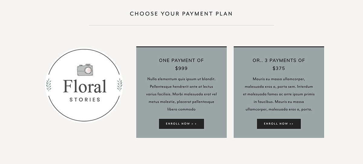
If you have different payment plans or pricing tiers make sure you display them in a clear way that details exactly what they will be getting. Make these different options interesting visually by using colored boxes to make them stand out. (see example below).
In Squarespace, the stack image block is a great way to display pricing in a very easy way. You can even upload an image of a small rectangle in your brand color and then style the block in the style editor with the colored background you would like.”
- Jodi Neufeld, Jodi Neufeld Design
“A great sales page is a recipe with a few key ingredients. Your sales page must convey the following to your customers:
I totally understand you
I've helped people just like you
Here's the proof.
When your copy conveys how deeply you understand your customers, they relax and begin to trust you—and selling is rooted in trust.
From here, you need to help people see what's possible for them by using the right imagery and authentic testimonials.”
- Deana Ward, Simple and Soulful Creative
“When it comes to sales pages, it's vital to get the copy right. By 'right' I mean that it truly speaks directly to your target audience.
Use phrases that are ‘their’ language. Mention their specific pain points and how your offer solves those issues. This all goes back to knowing your ideal customer inside out. Being able to use phrases that they have said themselves, for example as an answer to your survey they filled out or while you were having a conversation with them. Take note of the language they use and the problems they have because this will make it a lot easier to write your sales page copy content.
Place yourself as the expert, but also be relatable. Use phrases such as ‘I get you’, ‘I used to be where you are’, ‘I understand’.
Describe the real life versus the dream life - which can be achieved with your offer.
Describe the feelings your clients will feel after they purchase from you, something like ‘can you imagine how it would feel…’
Speak about your experience, but always bring it back to your audience and how they can also achieve success.”
- Abby Sealby, Wave Studio
“The most important thing about creating a sales page that converts is approaching it like a love letter to your ideal client or customer.
Understand what their experience is, how they're feeling, and what their biggest pain points are—as well as what they most want to create instead—and then ensure you've reverse engineered your offering so that it's clear you're providing the solution or change they desire... and that it's coming from your deep desire to serve and support them.
Reverse engineer the entire process by deciding what results and benefits you want to promise, how to best deliver them (teachings, organization, delivery, format, etc), and the best way to communicate that to your right people.
This will then inform the visual branding and page layout in a way that's more effective.”
- Stephenie Zamora, Stephenie Zamora Media
“Before you invest your time and money into a sales page, make sure you have a clear offer that's gotten your clients proven results. You can spend all your money on a gorgeous sales page, but if no one knows what you're selling or how you can help them, it will be harder to make a sale.
Before I ever take on a sales page design client, I always gather information on their marketing strategy, their audience, their offer, and and find out how many customers their business has served. If they have an offer that sells, we take conversion sales copy, and combine that with conversion design strategies to create a sales page that will help them take their sales to the next level. And you can't have good design without good copy that speaks to your audience and paints the picture about what life/business can be like after you help them solve their problem.
Design matters, but it won't work without all of the other pieces.”
- Melissa Burkheimer, Melissa Burkheimer
Final Thoughts
Designing and building a kick-a$$ sales page that converts like a dream for your own website is totally possible and from experience, I can tell you that it’s always time and money well spent.
Sales pages aren’t always the easiest thing to do and if it’s your first attempt, you might find the process totally daunting. But don’t let that hold you back! There’s always room for improvement and you’ll refine and up-level your sales page over time.
Sales pages can be as simple or as involved as you decide to make them, and what works for one website might not be the best solution for another. Depending on the type of website you’ve got or what kind of business offering your sales page supports, you’ll have different considerations than the next person’s.
Sales pages are not a “one size fits all” situation… but they’re also not rocket science!
As you can see from the experts' advice above, there are steps you can take TODAY that will make sure that your sales page is beautifully designed, is made up with crazy-good copy that converts like a charm, includes supportive visuals, testimonials and social proof, and a whole lot more.
Whether you're getting ready to work on your first sales page or revamp an existing sales page, you will want to keep these pointers in mind.
Trust the experts, they know what’s up.
By following their tips, you won’t be held up with ineffective strategies or sales page components that don’t actually convert. Instead, you’ve got actionable and practical tips you can start using today. Ready, set, ACTION!
If this expert roundup article has shown you how important it is to have a strategy in place when it comes to creating a sales page that converts, that's awesome! You can totally do this on your own, and the expert tips will be a great place to start. If you’d rather work with an expert on a done-for-you sales page project, check out my consulting services and get in touch today #shamelessplug.
Now it's your turn to tell us, do you already have a sales page up and running? Has this inspired you to launch your first offering with a killer sales page? Are there any tips you can try out on your own sales page today? What were you most excited to learn about when it comes to sales pages? I'd love to know so leave us a note in the comments below!
LAUNCH YOUR BEST SITE - FREE ECOURSE
Interested in learning more about what it takes to get a website up and running? Sign up for my free 7 day e-course!


