How to convert website visitors into clients - video collaboration with Louise from Solopreneur Sidekick
Websites that convert visitors into clients
Coming at you today with a really FUN video collaboration with my good friend Louise from Solopreneur Sidekick!
If you’ve ever wondered what sets a good business or professional website apart, what features and design strategies you can use to make sure your website converts like a dream, then you’ve come to the right place!
In this conversation, Louise and I talk about how to make sure your website converts visitors into clients. There are different strategies for services based business compared to e-commerce or websites that sell products, so we’re focused specifically on converting leads for your services based business through your Squarespace website here.
Hit play on the video or read the post below.
How to convert website visitors into clients - video collaboration with Louise from Solopreneur Sidekick
Click play on the video above or watch it on Youtube.
Also, please excuse the fact that the video focuses/freezes on Charlotte’s face at certain points - you will see Louise's beautiful face too! Oh the joys of technology hiccups during long-distance collaborations :)
My friend Louise from Solopreneur Sidekick is a web designer and tech teacher and I’m so happy to have her here with me today. We had so much fun recording this conversation and I know you will get lots out of our chat! This video is packed full of really solid and actionable information about how to convert website visitors into clients, so hit play or read the summary below. Enjoy :)
CHECK OUT THE OTHER VIDEOS IN OUR COLLABORATION SERIES HERE:
A lot of what we talk about relates to websites built on Squarespace but you can still apply many of the same principles to your website on another platform (e.g., Wordpress, Wix, Showit, Shopify, etc.).
Professional websites are different from hobby sites. They help you grow your business and serve your customers and connect with your ideal online audience- big difference! Let’s take a look at how you can convert website visitors into clients.
#1 Include a hook and persuasive copy on your services page
After the home page, the services page is arguably the next most important page on your website - and this is especially true for services based businesses. That’s why it’s so important that you nail the copy on your services page!
Speak directly to your ideal audience and dream client here. Your copy and written text should be engaging, detailed and give people enough information that they can make an informed decision.
We encourage you to go over your entire process or package on your services page in a lot of detail. It’s also a perfect place to talk about your availability and even include an FAQ section!
Most importantly, the copy on your services page should address and overcome any objections that potential clients might have. Use this as an opportunity to address and remove any hesitations or concerns they might have about working with you or investing in your services. Really sell the benefits of your services and highlight any results you can.
Include links to case studies, features, testimonials, portfolio profiles, etc. Social proof is key here! No matter what you do, your services page should show your value, reinforce your results, share important data or statistics, and above all - SELL YOUR SERVICES.
#2 Set up funnels
Did you know that 98% of first time site visitors will not convert into paid clients?
If you want their business, you need a strategy to warm these people/site visitors up. Nurture that relationship over time.
That’s where funnels come in!
Basic funnels work like this: you offer a super valuable freebie on your website that someone can receive in exchange for providing you their email address. This could be a PDF, checklist, video tutorial, templates, etc. This freebie gets automatically delivered by email and after that, an email sequence kicks off. The emails in this automated sequence deliver value and introduce you/your business to your new subscriber. The emails also give next steps and prompt the person on what to do next. For example, you might pitch your services or offer a free discover call (more on that below) because those convert very well.
The important thing to remember is that websites are not static and funnels are non-negotiable. They could be the make or break thing that gets someone to work with you, the feature that converts them from one-off casual site visitor into paying customer.
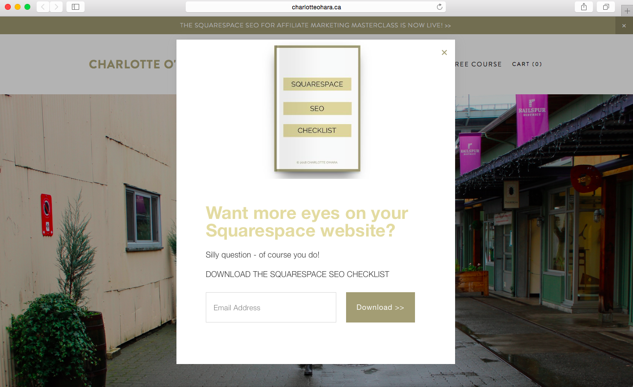
For example, here on my website charlotteohara.ca I offer a free Squarespace SEO Checklist which has helped thousands of people get started with Squarespace SEO and has helped me to grow my email list to where it is today. Once people opt in, I automatically send them the freebie and then follow up with my weekly newsletters. See screenshot below to see the popup with the freebie in action.
On Louise’s website Solopreneur Sidekick, she offers free trial of her course Website that Wows. (*affiliate link. If you click and purchase, I may receive a small commission at no extra cost to you). To see the email newsletter opt in and freebie in action on Louise’s website, take a look at the screenshot below.
Squarespace has improved their own Email Marketing Campaigns and that’s a fantastic place to get started if you’re totally new to it. The sign up forms look very professional and are easy to set up/insert.
Also options to use Squarespace’s integration with Mailchimp or another third party email service provider (e.g., Convertkit, Mailerlite, Infusionsoft, etc.).
To get started with your first funnel and kick off your email marketing strategy, begin by creating a valuable opt in freebie.
#3 Offer a free discovery call
One of the best ways to convert website visitors into paying clients is to take the conversation offline, especially if you’re still starting out in business and don’t have a waiting list of people who are dying to work with you yet (we’ve all been there, don’t worry if that’s you right now!)
When you offer a free discovery call on your website, you’re inviting visitors to take things offline and connect with you personally to talk about your services and the ways you might work together.
This establishes a real relationship and helps personalize the experience.
Discovery calls can be short and sweet, they don’t have to take up hours of your time. You can also set them to certain days of the week too so that they don’t interfere with your schedule (e.g., only accept discovery calls on Monday and Wednesday afternoons).
Squarespace has a wonderful integration with Acuity Scheduling, which sets up automated bookings directly to your calendar.
Free discovery calls convert really well for services based businesses but it also gives YOU the chance to see if you would want to work with the person - it goes both ways.
#4 Include CTAs throughout your website
No matter where someone is on your website, you should instruct those visitors how they can get in touch with you or take the next step in business. CTAs (calls-to-action) guide people on what to do next. Use CTAs liberally across your website, on every page/post. The CTA should be the leading point on every page so that there’s no confusion on what to do next.
CTAs work particularly well in two places on your website:
1. Within written copy. Use direct, instructional language (e.g., “click here to book a discovery call” or “Get in touch today to book your next session”)
2. Buttons. Buttons act as a visual cue on a web page or in a blog post which is why they should always be styled to stand out. Make your buttons big and bright so that they are obvious on the page and easy for casual website browser to see, click on and take desired action.
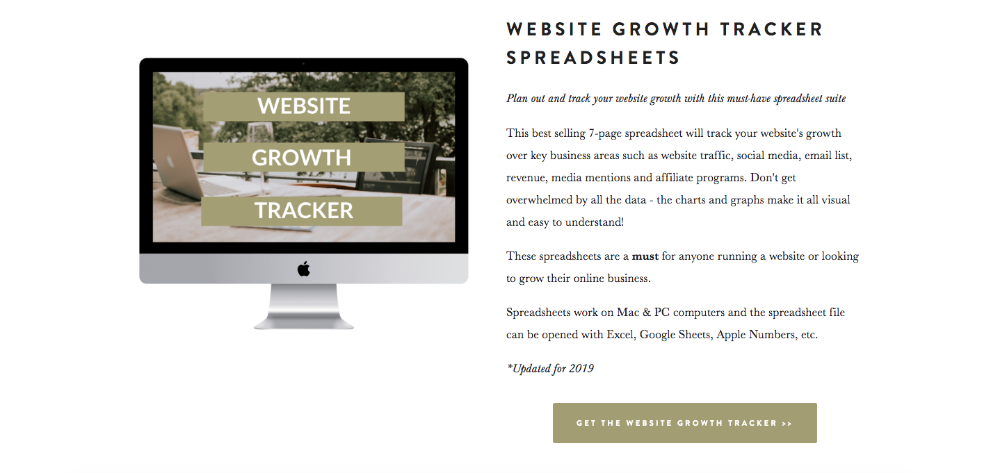
For example, on my products page (pictured above), you can see that I have inserted buttons as the main CTA for each product item overview. Look at how well those buttons stand out on the page, people are way more likely to click through to the product that way because it’s an obvious visual cue.
FINAL THOUGHTS
Thank you so much for checking out our video collaboration all about the features every professional website must have, we hope you enjoyed this video! We sure had fun making it :)
CHECK OUT THE OTHER VIDEOS IN OUR COLLABORATION SERIES HERE:
CONNECT WITH LOUISE:
Website: Solopreneur Sidekick
Subscribe to Louise’s Youtube channel
Get a free trial of Louise's course Website that Wows here. (*affiliate link. If you click and purchase, I may receive a small commission at no extra cost to you)
Join Louise's FREE Facebook group, Website Newbies, for entrepreneurs who want to create their own website.
LAUNCH YOUR BEST SITE - FREE ECOURSE
Interested in learning more about what it takes to get a website up and running? Sign up for my free 7 day e-course!
