Choosing The Right Squarespace Template
It’s no secret that I love Squarespace and that I build my client websites exclusively on this platform. The templates are sleek, customizable, responsive and set up for SEO. Can’t beat that!
It’s easy to convince people that Squarespace is the way to go, but the next question I inevitable get asked is “How do I choose the right Squarespace template?”.
If this is your first time building a website, specifically on Squarespace, it can seem overwhelming. Lucky for you, I’m here to walk you through the process of choosing the right Squarespace template for your site, from start to finish. I’ll lift the curtain and help you compare the features and functionality of the different templates to really decide what works best for you.
I’ll even let you know my favorite Squarespace templates to use!
The first thing to keep in mind is that while Wordpress has literally thousands of themes to choose from, Squarespace “only” has about 45 templates to choose from. Some people might see this as a downside but not me. Having a somewhat limited selection to choose from is a great thing, in my mind, because each template has been tested and optimized by the Squarespace team (to make sure that it is as functional and versatile as can be). This means that you can rest easy knowing that whichever Squarespace template you choose, you are guaranteed a website that looks good and has all the built in features you need. Also, having a smaller number of templates to choose from removes the overwhelming feeling of too many options and the possible/probable feelings of regret or uncertainty. More on this later in the article!
Step 1: Determine the scope of your website
Before you begin playing around with Squarespace templates, you need to know what type of website you’ll be building. I talk about this a lot in my free e-course but basically, you need to outline a simple site map of the pages on your website (e.g., Home, About, Blog, Contact, etc.). You should also make note of some of the basic functions your site needs to have. This can be as simple as writing a few notes on a piece of paper or brainstorming in a Google Doc.
This step is important because the templates are divided into three categories (more on that below) and within them, many of the templates are designed with specific needs or implementations in mind.
If you know you’re going to need e-commerce functionality, for example, it’s best to search through the Online Store templates from the start and not have to switch over down the road.
Note: this article will focus primarily on the Website category, although I will talk a little bit about the Online Store categories as well.
Step 2 : Building a new website on Squarespace
If you’re starting from scratch and building a brand new Squarespace website, you’ll need to sign up for a free trial account. At any point during the 14 day trial you can purchase a plan and connect your domain to go live. You can do that here if you haven’t already.
Interested in learning exactly how to launch your best website? I’ve got a free e-course that’ll walk you through every step of the way. Sign up for it here!
Once you’ve got your free trial account, you will be prompted to choose a template from one of Squarespace’s three categories:
Cover Page
Website
Online Store
When you click through to the Website category section, you’ll see all the templates available. But wait! Before you start scrolling through and browsing, there are a few things to consider.
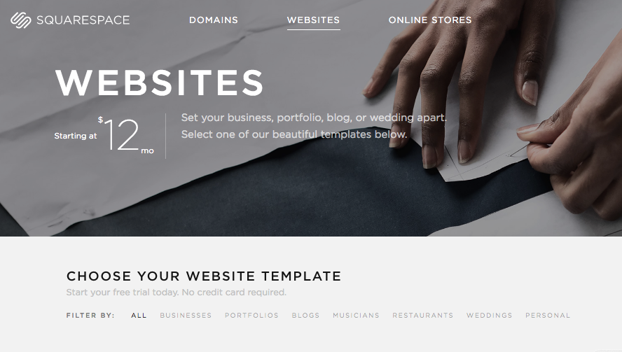
As mentioned, this article is going to focus on choosing the right Website template for your site. Once you’re narrowed into that particular category, you’ll see that Squarespace has it further sectioned off into sections (e.g., business, restaurants, portfolio, weddings, etc.), as seen in the image below.
This is a very helpful starting point but know that you are not limited to the category a template falls into. My site is a perfect example of this. I currently use the Pacific template even though it is suggested in the Restaurants section.
Step 3 : Consider Functionality and Features
At this point, you know what type of website you’re building and you’ve sketched out a basic site map. This will help guide you through picking the right Website template from the Squarespace library.
Next up, you should take a few moments to think about what features you want your website to have. It will be hard to pick the right template if you’re only focused on aesthetics so this is where it’s best to get a little analytical. For example, do you want a blog? If so, does it need to have a sidebar? How about a portfolio to showcase large images? Do you want to display content in a gallery or through section blocks?
It’s okay if you don’t have everything sorted out before you start browsing through the templates but these are definitely things to consider.
Here’s a rundown of a few of the features I pay special attention to when choosing the right Squarespace template:
Portfolio: If the website needs to display many large images, I’ll want to pick a portfolio that supports this.
Blog Page: I’ve already explained why every website needs a blog, but not all blogs are created equal. If you are particularly focused on displaying meta data or lots of post information in your blog, that will affect which template you choose.
Index Page: Index pages are an incredible way to organize content (text and images) in a single collection, usually in a series of scrolling sections. Index pages will vary a lot depending on the template and not all templates support them. If you like the look of an index page but it isn’t offered in your first choice template, you can always work around this by displaying the content from multiple collections on a single page using summary blocks.
Related : How does SEO work for Squarespace Index Pages?
Gallery Page: I love including full width images in my websites but sometimes a gallery block makes more sense. Think about the image aesthetic you’re going for because that will determine into the template you go with.
Social Icons: Squarespace makes it super easy to connect social media accounts with their templates, but depending on where you want those links displayed, you will end up choosing a different template.
Navigation: Another thing to consider is the navigation menu placement. Will a simple top navigation be enough or will you also want a secondary navigation at the bottom of your pages? Not all templates allow secondary navigations so be sure to consider this.
Sidebar: I’m not a huge fan of sidebars but if this is something you want to include in your website, be sure to pick a Squarespace template that offers them.
Footer: Most templates allow footers but did you know that some of them even support two footers? This is an awesome feature if you want to highlight an offering across all pages.
Here is a great chart that compares the functionality of the different Squarespace templates.
Now that you have a better idea of what features you want in your new website, it’s time to start browsing through the template library. About time, eh?
Step 4: Browsing Squarespace Website Templates
Browsing the Squarespace templates is heaps of fun especially once you know what you’re looking for!
Once you’re in the Squarespace Website template library, you can browse the different templates, view their demo sites and even see examples of live sites. I love checking out the Squarespace template demo sites because they do a great job of showing you all the functionality in visual form. Sometimes it’s nice to see something, not just read it, you know? I’m also a huge fan of looking at live examples of customer websites using a particular template because it’s a real goldmine of inspiration. The example sites are constantly changing as well so there’s no shortage of web design ideas.
After choosing a Squarespace template, you’ll be able to customize it and make it your own by selecting certain features, page layouts, design aspects, etc.
Step 5 : Check out the Mobile / Responsive Template View
This is a step that people often forget but I recommend checking out how a particular template looks in responsive view before settling on it as your top choice. This should be considered because all templates will reconfigure differently depending on the size of the device a website is viewed on (e.g., smartphone, tablet, laptop, desktop, etc.). By making sure you like the alternate view of a template before you settle on it, you have peace of mind knowing that you’re happy with the template in every form.
My Favorite Squarespace Templates
At this point, I’ve used and played around with most of the Squarespace templates available. That said, there are a few that I often come back to because I love their aesthetics as well as the features and customization available.
My favourite Squarespace templates are all in the Brine template family:
Rally
Brine
Maple
Mojave
I’ve built multiple websites using the same templates but I’m able to make them look unique thanks to all the tweaks available. #winning
Switching Squarespace Templates
Choosing your first Squarespace template is fun and a little stressful if you think that it’s set in stone. There are many features I love about Squarespace but hands down, one of my favourite things is how easy it is to change templates! Your needs might change, perhaps you realize you need different functionality, or maybe you want to revamp the look and feel of your website - these are just a few reasons why you might want to switch Squarespace templates. Luckily, the process couldn’t be simpler.
At any time, even if your website is live, you can preview a new template and switch over without starting over. This is wonderful news if you’ve already spent time building and growing a website and you aren’t interested in starting over! Here is Squarespace's excellent article on switching templates.
Final Thoughts
As you can see, choosing the right Squarespace template isn’t that hard but there are things to consider before making a final decision. If you let functionality and your site needs guide your decision making, you’ll be thrilled with the design customizations each template allows. At the end of the day, you can always play around with different Squarespace templates until you end up with a site that looks and functions exactly how you want. Isn’t that a wonderful thing?
I’d love to know, how did you pick a Squarespace template? What are your favourites? Did you pick based on aesthetics or functionality? Leave me a note in the comments!
LAUNCH YOUR BEST SITE - FREE ECOURSE
Interested in learning more about what it takes to get a website up and running? Sign up for my free 7 day e-course!

