How to prepare content for your website - video collab with Louise from Solopreneur Sidekick
Preparing website content - text, visuals, etc.
We’re coming in HOT today with another (wonderful, glorious, thrilling, info-and-action-packed) video collaboration with my good friend Louise from Solopreneur Sidekick!
If you’ve ever wondered how the heck to prepare the website for your website, then my friend - you are in the right place! From the early planning stages to prepping website text/copy and deciding on the imagery and visual components, we’ve got you covered.
In this conversation, Louise and I talk about how there’s so much content to prepare for your website, whether you’re building a brand new site from scratch or working on a redesign project. Content doesn’t just come together on it’s own - nope, there’s a whole lot of strategy that goes into really good website content! Remember that your goal is to connect with your ideal audience, future clients and potential customers, and good content will get you there.
Hit play on the video or read the post below.
How to prepare content for your website - video collab with Louise from Solopreneur Sidekick
Click play on the video above or watch it on Youtube.
My friend Louise from Solopreneur Sidekick is a web designer and tech teacher and I’m so happy to have her here with me today. We had so much fun recording this conversation and I know you will get lots out of our chat! This video is packed full of really solid and actionable information about how to convert website visitors into clients, so hit play or read the summary below. Enjoy :)
CHECK OUT THE OTHER VIDEOS IN OUR COLLABORATION SERIES HERE:
A lot of what we talk about relates to websites built on Squarespace but you can still apply many of the same principles to your website on another platform (e.g., Wordpress, Wix, Showit, Shopify, etc.).
Planning out and preparing the content for your website is no joke, there’s a lot to consider! It’s a combination of visual and written elements, on top of strategic layout and page structure, so let’s jump right into the goodies.
#1 Plan out the pages of your website with a basic site map
Before you even begin building the site or preparing your content, the very first thing to do is to plan out a basic site map.
This doesn’t have to be anything fancy, just draw out a basic sketch that plots out all the pages of your website and how they fit together.
Think about your your main menu or navigation at the top of the site - what pages fit in there? How and where do the other pages on your website link together? Squarespace has an entire section for not linked pages, which is where many of the secondary pages on your website will be located, but you should still have a good understanding of how the content all connects and as accessed.
Here are some pages that are included in most websites:
contact page
services page
product page
resources page
blog
faq page
portfolio or testimonials page
freebie opt-in page
Those are common pages for most services-based businesses but if you are an e-commerce website or blog, obviously you will have different pages on your site. Totally up to you!
#2 Write out and prepare the copy or written content of each page in advance
Louise and I both suggest that you begin with the written copy of each page first, and then plot out how you’ll include other elements and visuals around that text.
If you’re stumped or confused about how to prepare written copy or what to write on each page, we suggest that you turn to templates to help guide you through the process There are so many templates available that will prompt you with what information to include on each page of your website, because the needs and strategy will be different depending on what you’re focused on (e.g., About page vs Services page).
Louise’s program Website That Wows includes templates to help you prepare the written copy of key pages on your website so be sure to check that out, it’s all there in her free trial which you can sign up for here.
You can also search Pinterest for templates (e.g., “homepage templates” or “services page templates”, as you can see in the example below) and those resources will give you solid guidelines to follow or be inspired by.
There’s a huge amount of strategy involved in preparing the copy or written content of your website so don’t rush through this very important step!
#3 Collect cohesive visual content
Next up is the visual content that will be included on your website. Louise and I recommend that you go back to your brand identity and think about how you describe your brand/business/website’s look and feel.
Here are a few styles you might go with:
modern
professional
minimalist
edgy
traditional
feminine/masculine
bold
colourful
Get super clear about the brand vibe you’re going for and what you want to communicate with the visuals on your website (and other platforms like social media, email marketing, etc.)
Louise has a great free quiz that you can check out : What’s your brand style?
Once you have an idea of what brand style you’re going with, it’s time to start collecting inspirational images. We recommend that you go to Pinterest (it’s free!) and collect inspiring images, colour palettes, page layouts, website page examples, etc all in one place.
Inspiration boards (whether they’re on Pinterest or somewhere else) are really useful for anyone who’s preparing the content of their website, and this applies for both DIY sites or if you’re working with a designer. Remember, you can set your Pinterest board to either public or secret so don’t worry if it’s a work in progress or ever evolving! See below for an example of “Branding: Classic/Luxe” on Louise’s Pinterest account.
When collecting images or things to include on your inspiration board, think back to your branding keywords that you picked out above. Type those into Pinterest (e.g., minimalist branding/website/graphics/etc.) and pull images from the results.
#4 Collect images and photography
Most websites use either branded photos (e.g., from a photoshoot) or stock photography, or sometimes a combination of the two.
Take those same branding keywords (e.g., minimalist design) and use a tool like Unsplash to find high quality, free images and stock photography for your website. If you stick with the brand keywords and refer back to your Pinterest inspiration board, you’ll end up with a much more cohesive look and feel for the images you use on your website.
Remember that the content on your Pinterest inspiration board should form the basis of your website’s visual identity. All the photos/images you pick for the website will fit in with that style - we’re going for a cohesive collection here.. Aim for the same tone, similar look, and a standard “feel” for the photos and images throughout your website.
#5 Branded and graphic elements
Louise does a really awesome job at included branded and graphic elements on her website, Solopreneur Sidekick, so be sure to check it out if you haven’t already to see what I mean!
We recommend that you use tools like Canva which is a free software that’s great for non-designers. Canva lets you find and incorporate branded & graphic elements, and use them as overlays on photos or icons, etc.
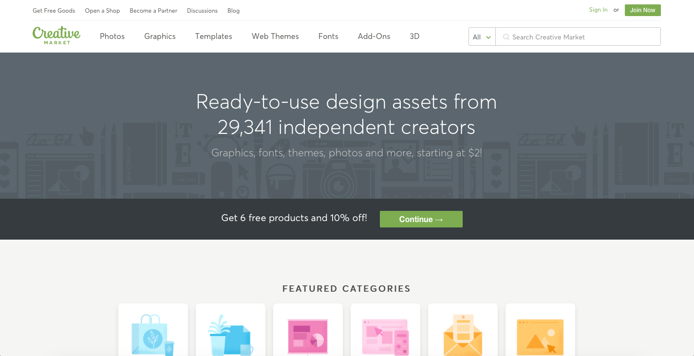
Creative Market is another great place to find high quality branded and graphic elements, no matter what type of brand identity you’re going with.
You can insert image blocks throughout the pages and blog posts of your Squarespace website. Again, Canva and Creative Market at great sources that you can use. Stick to the branding keywords and you’ll have plenty of options to chose from !
These branded and graphic elements will really set your website apart and they make your content pop.
#6 Customize your Squarespace template
Louise and I both recommend that you pick a Squarespace template that is flexible and customizable. We are both huge fans of templates in the Brine family so those are always a good bet.
Louise also recommends that you choose the template you like based on the font pairings because that’s a difficult branding element for non-designers to get right. This is a good tactic to use because the template doesn’t matter as much as you think, especially if you’re going with a Brine template anyways. You’ll have the font pairings taken care of of and then you can change out the colours, set up other site stylings, and really customize the rest of your site by building out a strong format for your content (text, images, etc.)
FINAL THOUGHTS
Thank you so much for checking out our video collaboration all about how to prepare the content for your website, we hope you enjoyed this video! We sure had fun making it :)
CHECK OUT THE OTHER VIDEOS IN OUR COLLABORATION SERIES HERE:
CONNECT WITH LOUISE:
Website: Solopreneur Sidekick
Subscribe to Louise’s Youtube channel
Get a free trial of Louise's course Website that Wows here. (*affiliate link. If you click and purchase, I may receive a small commission at no extra cost to you)
Join Louise's FREE Facebook group, Website Newbies, for entrepreneurs who want to create their own website.
LAUNCH YOUR BEST SITE - FREE ECOURSE
Interested in learning more about what it takes to get a website up and running? Sign up for my free 7 day e-course!


